Good morning and welcome to Monday!!! The sun is shining, the grass is green, and the daffodils are yellow and I love spring! Those blah days of winter are disappearing – even if we still have another snow or dip in temps, those colors are back instead of the winter gray blahs. Ugh. So, it seems appropriate to continue looking at the new In Colors coming the first week of May. And today we are looking at my favorite new color – Secret Sea!!!
Sharing Cloud Cover With The Gray Palette!
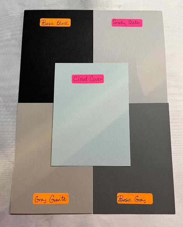
After I’d already taken these pics I noticed the ray of sunshine across the colors. I SHOULD have re-taken the photos, but I think it bears witness to the whole “natural light” thing – notice the difference between the natural versus white lighting I used??? Always check your colors in natural light!
We compared Cloud Cover last week to the blues, but I see gray in this new color as well. It will pair nicely with all of the colors above, but I especially love it with Basic Gray. My favorite gray in our color palette is Smoky Slate and I rarely use Basic Gray – I probably don’t use 3 packs of this color in the total of a year! (That may still seem like a lot, but when you think I just used 3 packs of Old Olive this weekend cutting cards for ONE class, 3 packs over the span of the year is very little).
And For The Final New In Color – SECRET SEA!
Secret Sea has quickly become a favorite of mine, and I can’t wait to see the color combos people will design with. Just like Cloud Cover fits into a couple of color palettes, the same is true for Secret Sea. Let’s look at the blues first.
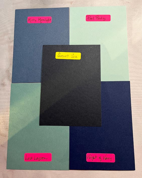
This picture shows how much darker Secret Sea is over Night of Navy. There are definitely blue shades there, but the color is so rich and dark, you would almost think it’s black, wouldn’t you? I especially love it with Lost Lagoon!
Secret Sea With The Green Shades

I heard many demos talking about Secret Sea reminding them of Evening Evergreen, and I wish I piece of Evening Everygreen left to compare! I love seeing Secret Sea together with our green blue colors – Pretty Peacock, Lost Lagoon, Cloud Cover, and Pool Party. These colors will be awesome together!!!!
Final Thoughts….
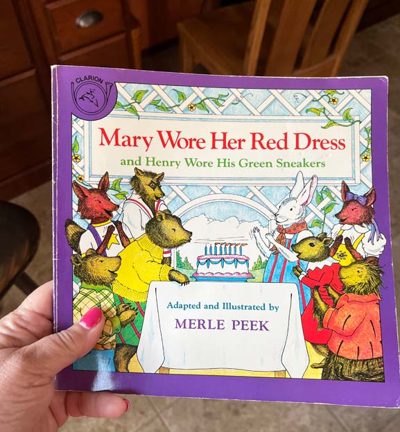
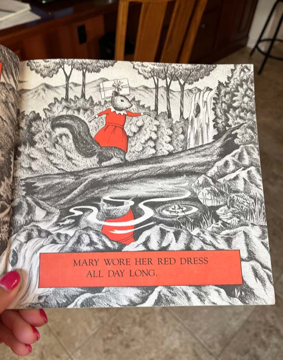
Over the years of teaching, I included literature in my lessons for the young ages, and one of my favorite books to share was “Mary Wore Her Red Dress” by Merle Peek. My lit selections had to be ones that had a song to teach, so instead of reading I sang to my kids. This book is WONDERFUL for introducing colors and observing change. If we were to turn the page, you would see and hear that Henry wore his new green sneakers and all of the tree tops, bushes, grass would be green along with the red items. Everything else – black and white. Each page introduced a layer of color until the end of the book where EVERYTHING was in color. The kids tried to anticipate what color would be on the next page, and afterwards we turned the song into a game, with sung phrases such as “who’s wearing a pink sweater?”
Color is such a wonderful part of our world, and I am so thankful that Stampin’ Up has 50 shades of colors for us to play with during our paper crafting journey. We all have our favorite go-to colors, and we lean towards different color collections. I tend to design with regal and bright shades. Which do you prefer?
And now, I have that little ditty in my head, cause I can hear “who’s wearing Calypso Coral?” singing in my head. Gonna be one of those days! Until tomorrow, have a great day, enjoy some sunshine and color, and God Bless!!!

 SUBSCRIBE
Leave a Reply